Hi.
Welcome to my blog. I document my adventures in travel, style, and food. Hope you have a nice stay!

Welcome to my blog. I document my adventures in travel, style, and food. Hope you have a nice stay!


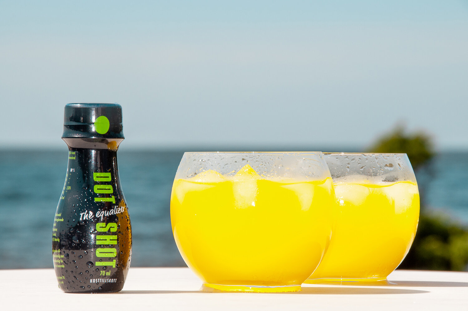
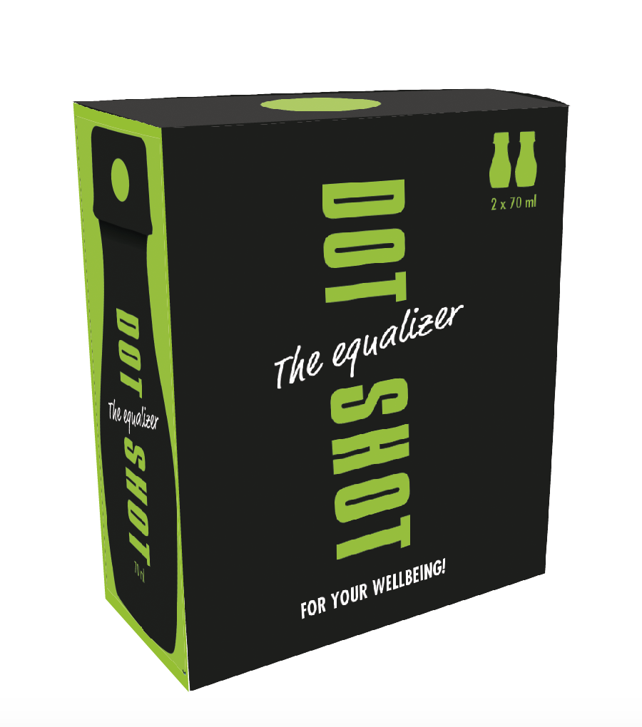
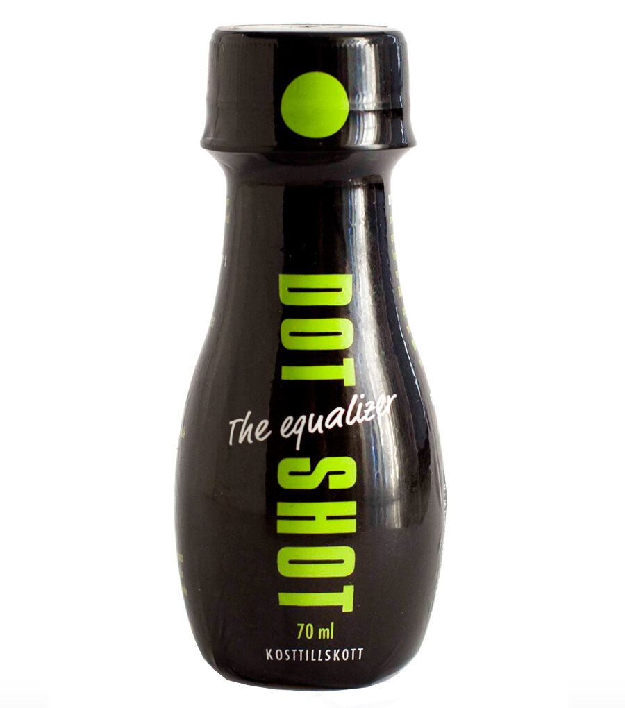
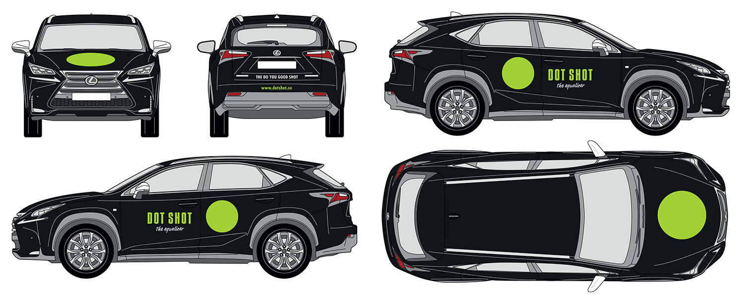
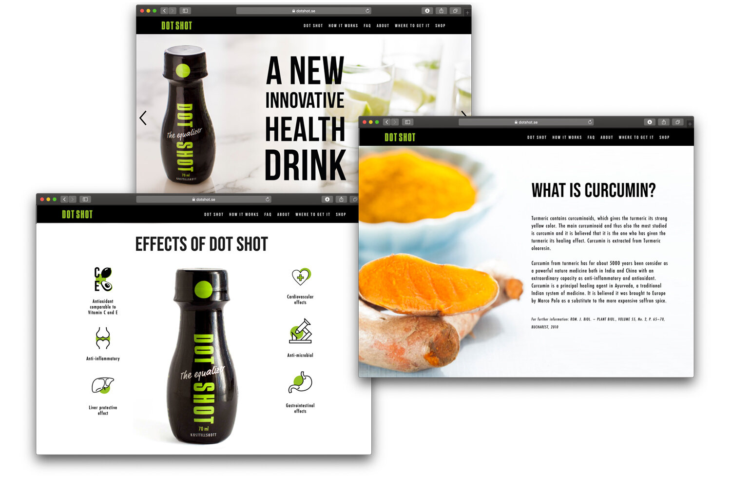

More information: www.dotshot.se


LOGIC
A Swedish fashion retailer for people who want to live the urban lifestyle.
Big fan of brands.

MAGIC
Popular appeal with a contemporary twist
Fashion portraits of Swedish people of varying degrees of celebrity
The logo an ever-present aspect in all communications

SUCCESS
Turnover 2002: 700 million SEK, Turnover 2009: 1,500 million SEK
Total store visits in 2002: 18 million. Total store visits in 2009: 32 million
2009: Sweden’s best men’s fashion retailer.
2009: Member’s club with 250,000 loyal, active members, representing 46% of turnover.
All You Want for Christmas
MQ Give a Little Bit
![]()
Brand realignment, retail environments, logo design, visual identity, packaging, and advertisements

An old traditional bank sought for a new identity for the turn of the millennium and the new era that was to come.
Skandinaviska Enskilda Banken merged with Trygg-Hansa to become SEB. One of the most well-known and distinguished Swedish banks joined up with one of Sweden’s most well-known insurance brands to form a new financial player within banking and insurance that would be ready for the future.


LOGIC
From sleepy library to 24-7 digital storefront and meeting-place for avid readers.
From book warehouse to display window for new releases.
From basic sender’s logo to communicating their corporate identity.

MAGIC
A new, contemporary, unique graphic identity and a new value proposition.
Energetic colour, rotating clock hands, and a new animated logo that suggests web presence and 24/7 availability.
Presence and communication in every point of contact, from the website to the physical packaging.

SUCCESS
In 2013, Bokus won market share from a leading competitor in an e-commerce market that was slowing down and increased their sales by 14%. This growth continued in 2014, and August of that year reached their best monthly sales figures in 17 years of being in business!
![]()
One of the world’s most recognised brands, with an iconic packaging design, needed to undergo a facelift to stay fresh in the early 2000s, facing stiffening competition. The brand design needed to go from exclusive bar exposure of the most famous bottle design in the world, to volume sales and a need for exposure of the product in the retail setting, without compromising brand recognition.
![]()

LOGIC
Creating the flower shop of the future, to face the dual threat of new sales outlets entering the market and new consumer habits.
Targeting younger, highly aware, and modern consumers, who decorate their homes with flowers, and who like to bring “something” along when they are invited to other people’s homes.
Vanguard retail locations to act as role models for the 375 shops, and a revitalisation of the whole Interflora brand.

MAGIC
Interflora Fresh – a new name that signalled an upgrade, revamping, and rejuvenation of the brand, keeping it firmly in touch with its legacy.
A new, unique visual idiom and graphic style for use in retail locations and advertising, which highlights the products and conveys a modern, inspiring “indoor market” atmosphere.
All products to be branded with specially designed wrapping paper, wrapping tissue, ribbons, stickers, bags, etc.

SUCCESS
20–30% increase in revenue over the first year, compared to Interflora locations not included in the programme. Five years on, revenue is still growing from year to year.


LOGIC
The days that matter aren’t the everyday, humdrum ones. The days that matter are the memorable ones, which you spend in the company of your nearest and dearest–your tribe, if you will. An everyday experience becomes exceptional when it is shared with others on a holiday trip. Fritidsresor can take you far away from the things you’re used to experience, and offer you experiences you will never forget.

MAGIC
A unique visual identity that will set us apart from other travel agents in the four Nordic countries. A visual idiom that is instantly recognisable, regardless of the medium. A new, clarified identity that will bring travellers from the various Scandinavian nations together once they’ve reached their destinations.

SUCCESS
Improved popularity and recognition, and a significant amount of progress over the last two years!
TUI Vinterresor
Blue Village: Visual Identity


LOGIC
Pivot the brand from “medical expertise” to “excellent taste”. Broaden the target market from the small group of lactose intolerants to include anybody who takes an interest in food and health. Highlight taste, enjoyment, and the feeling of well-being, rather than talk about problems and medical conditions.

MAGIC
A new, impactful visual look seeped in the enjoyment of food, inspiration, and quality. Focus to lie on settings in urban kitchens, and the delivery of innovative products that appeal to everybody who cares about food and healthy living.

SUCCESS
Despite increasingly intense competition from well-known brands, Valio’s sales increased by 10% last year at a premium price, and they have managed to retain their position as market leaders in the lactose-free segment.

Logo, packaging design, and visual identity

The manufacturer of the world’s favourite breakfast food concluded that their product line had grown too wide spread, and lacked cohesion. At the same time, private label options were ramping up the competition for retail space. They called us.
![]()

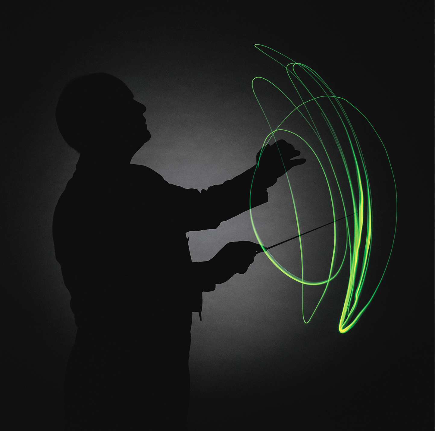
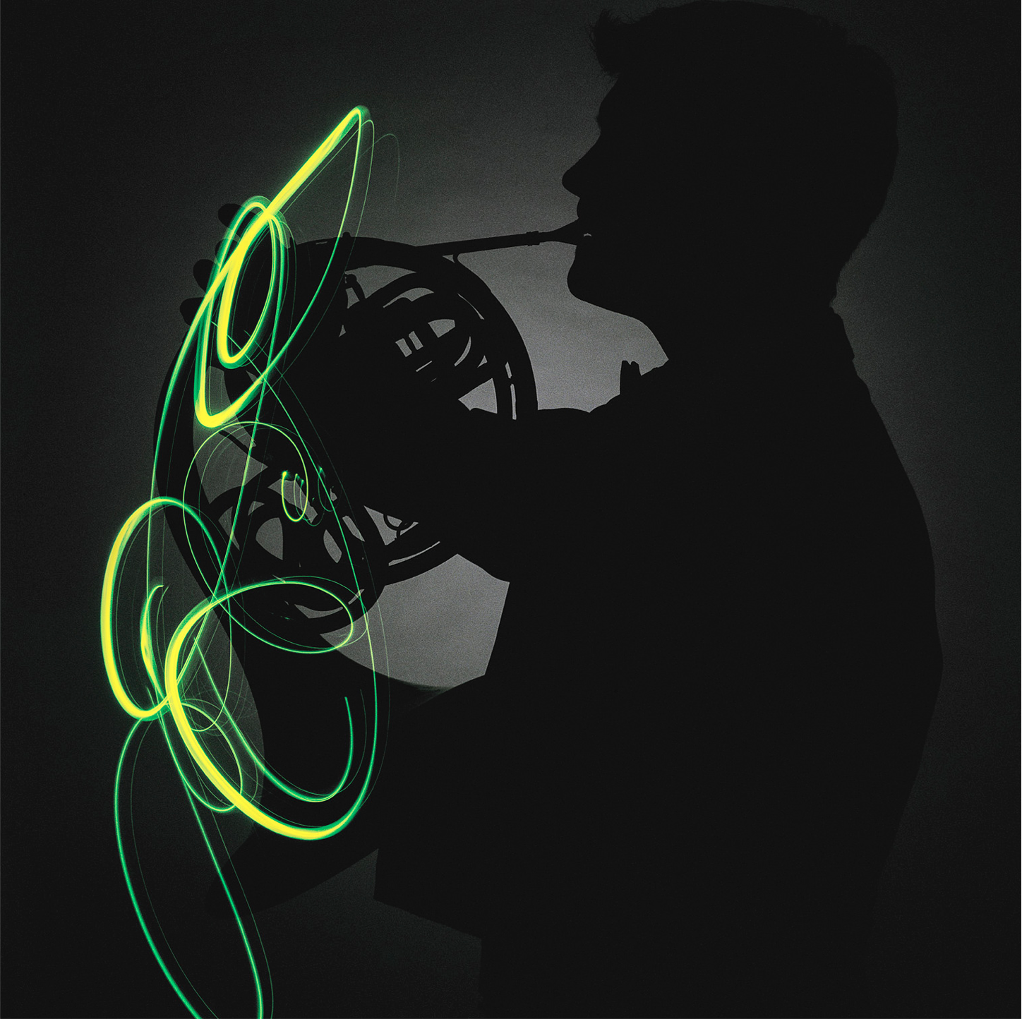
LOGIC
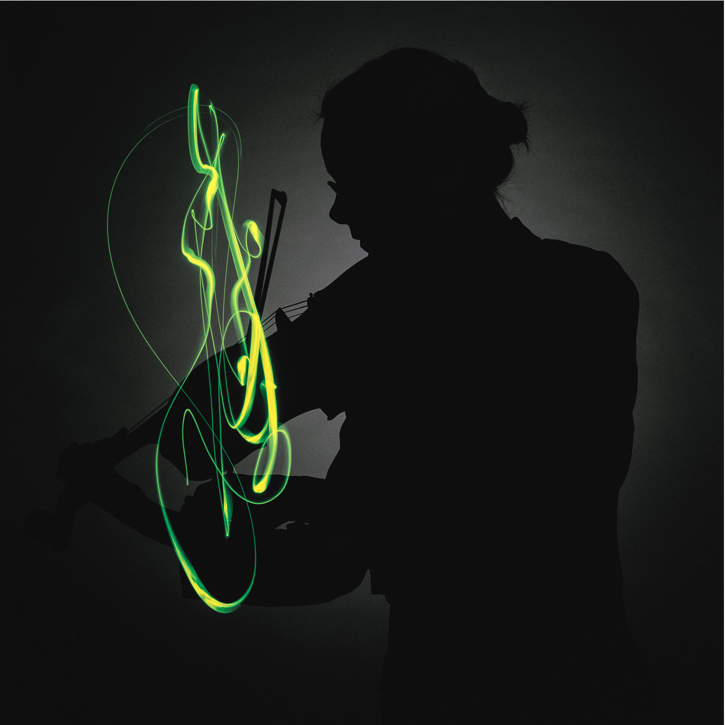
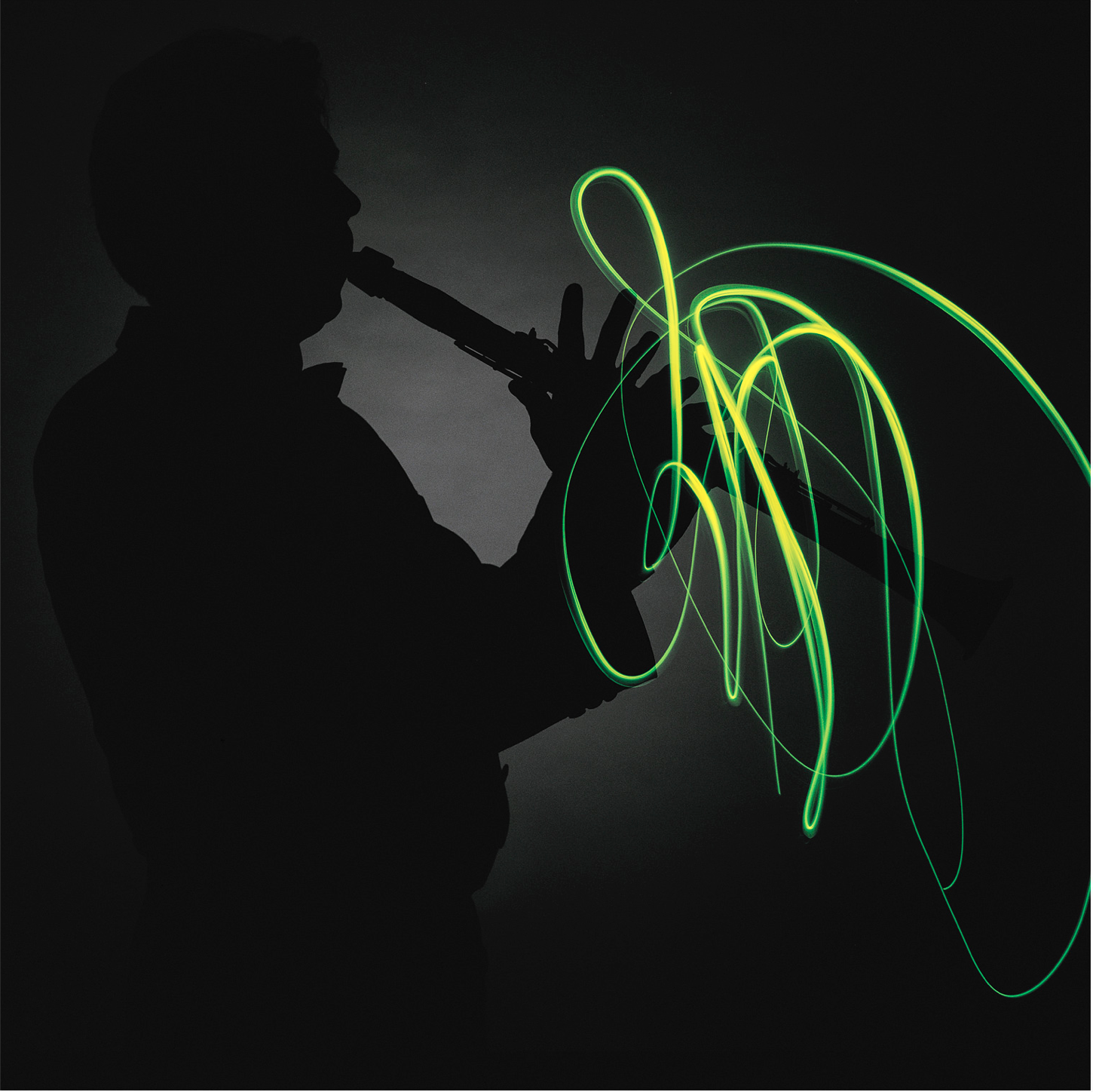
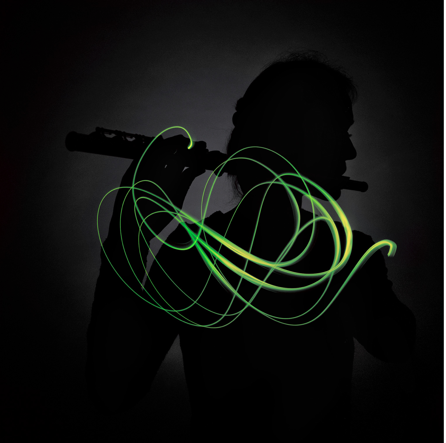
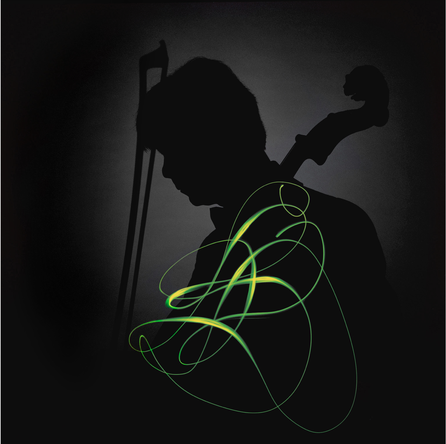
The sinfonietta consists of the finest chamber musicians in the country, who have banded together to form an orchestra. The individual musicians also all perform with other orchestras, and sought a unified identity that would represent them as the Stockholm Sinfonietta. They wanted a clarified, strong, and professional image, which could position the orchestra as the very best in its genre. The visual approach had to be strong enough to match the artistic qualities of the musicians.

MAGIC
We looked for a visual way of conveying the experience of the music and the various musicians’ instruments. They each have their own unique, individual approach to handling their instruments; their own individual trademark within the orchestra. This motion was captured by photographer Svenolof Jonn, who used a special technique invented for the purpose. The captured footage became their distinguishing feature, and each individual member’s unique “calling card”. The various beautiful patterns combined to form the foundation of the Sinfonietta’s visual identity, and were used in their marketing to improve recognition and establish the Stockholm Sinfonietta brand.


GYÖRKI+ is a recently founded venture in the field of brand development and design. Because of that, some of these reference assignments and case studies date back to the time I spent in my previous engagements with Brindfors Design and Catt and Co–two agencies where I have been a founder and partner. These cases were selected to offer examples of my approach to brand building, and to demonstrate my philosophy of aligning strong design with strategic insight to deliver value to businesses. If this interests you, I’d be delighted to tell you more about the work that went into developing these brands, and how we can help you and your brand to grow stronger and find even greater success. Just give us a call and let’s talk about our methods +46 708 23 85 27 or peter@gyorkiplus.com
